Millu
Building brand consistency across segments
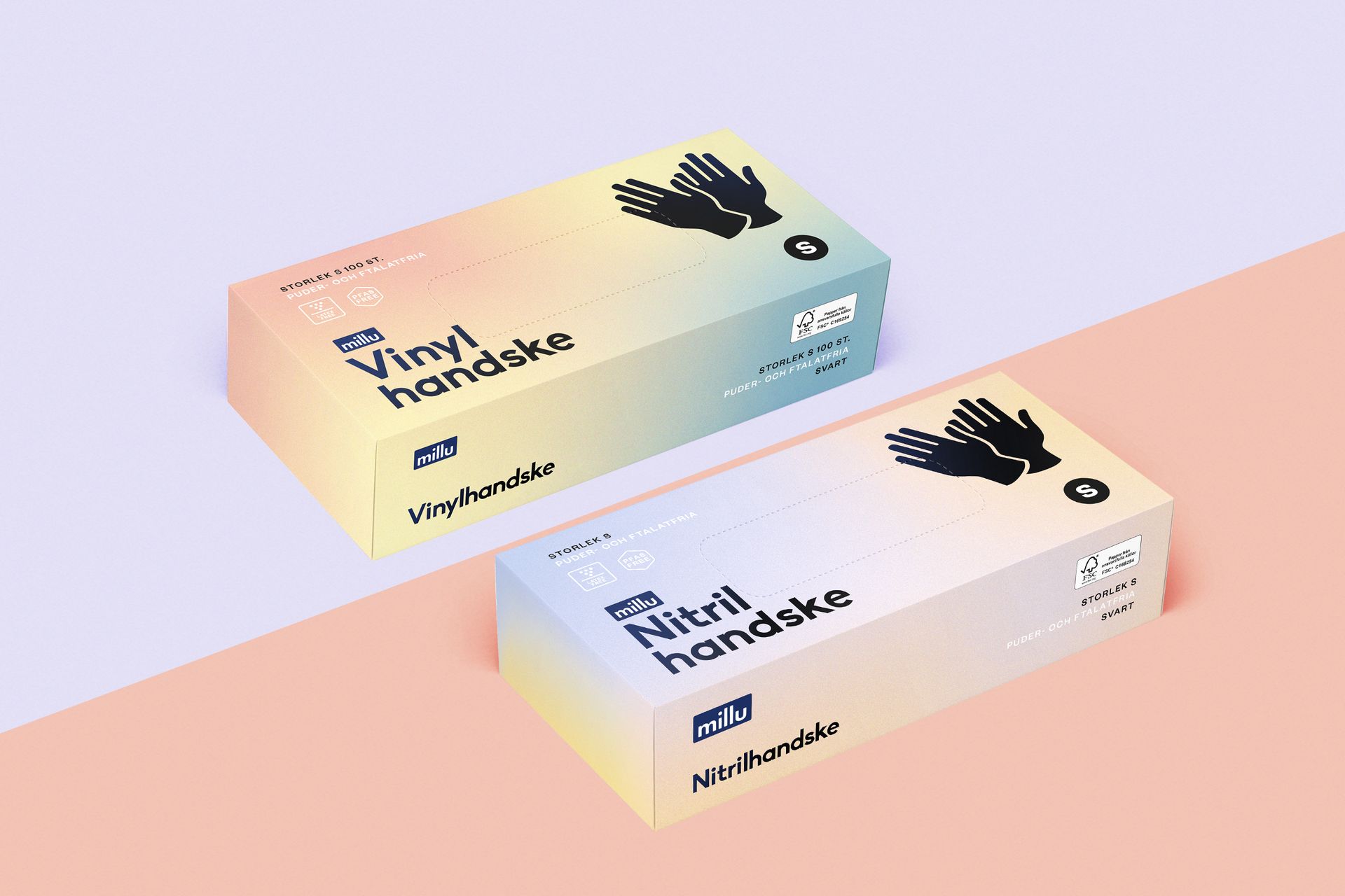
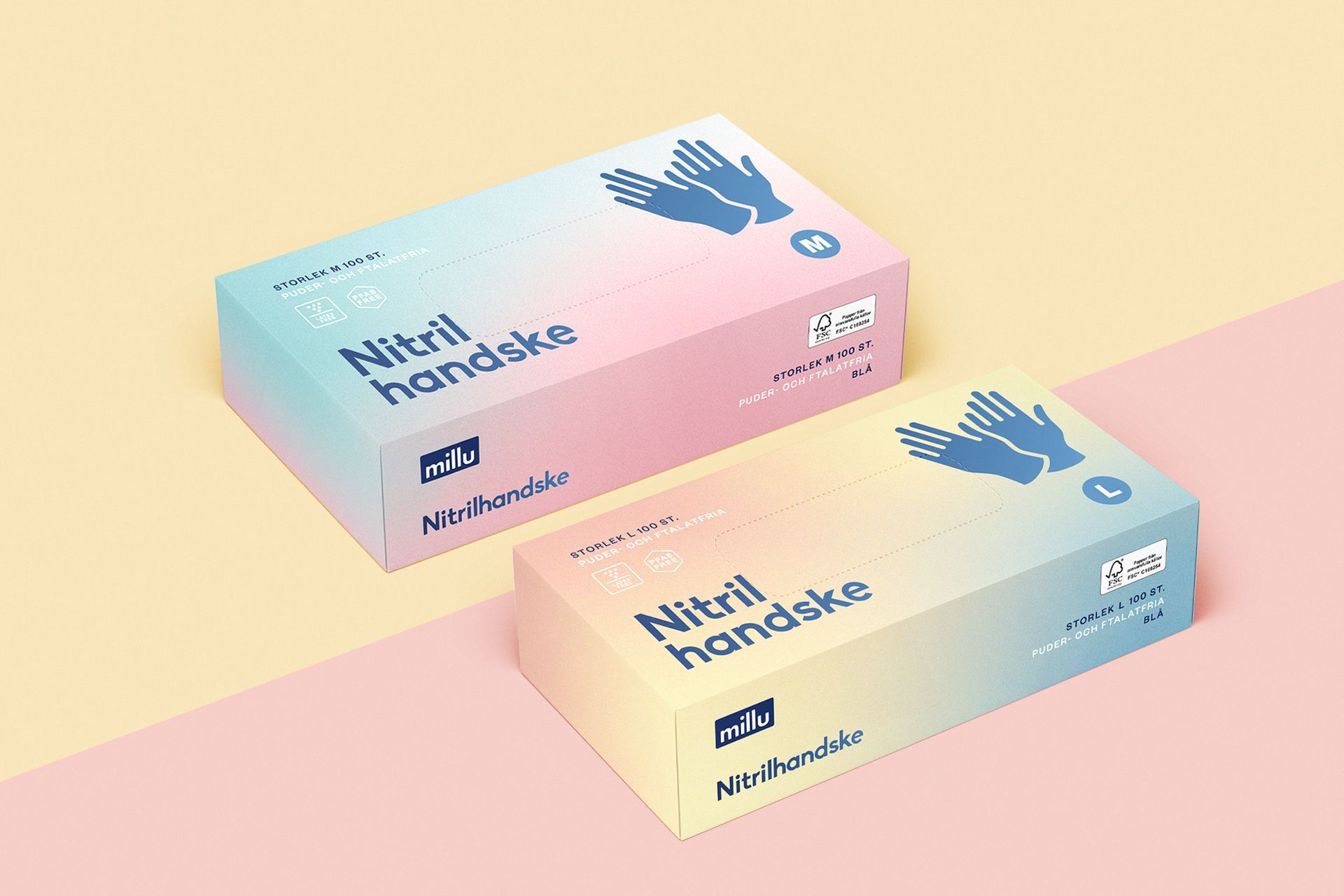
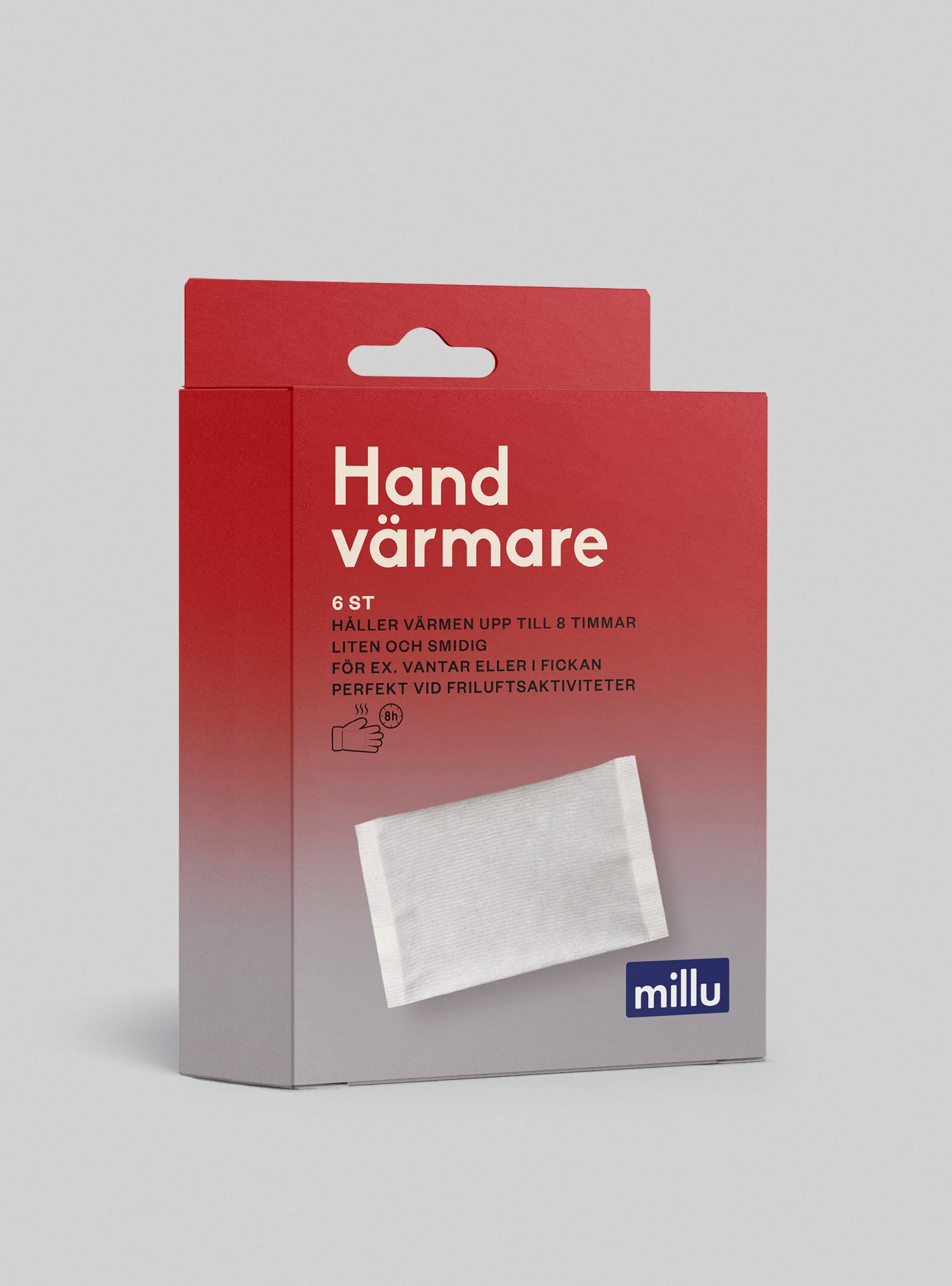
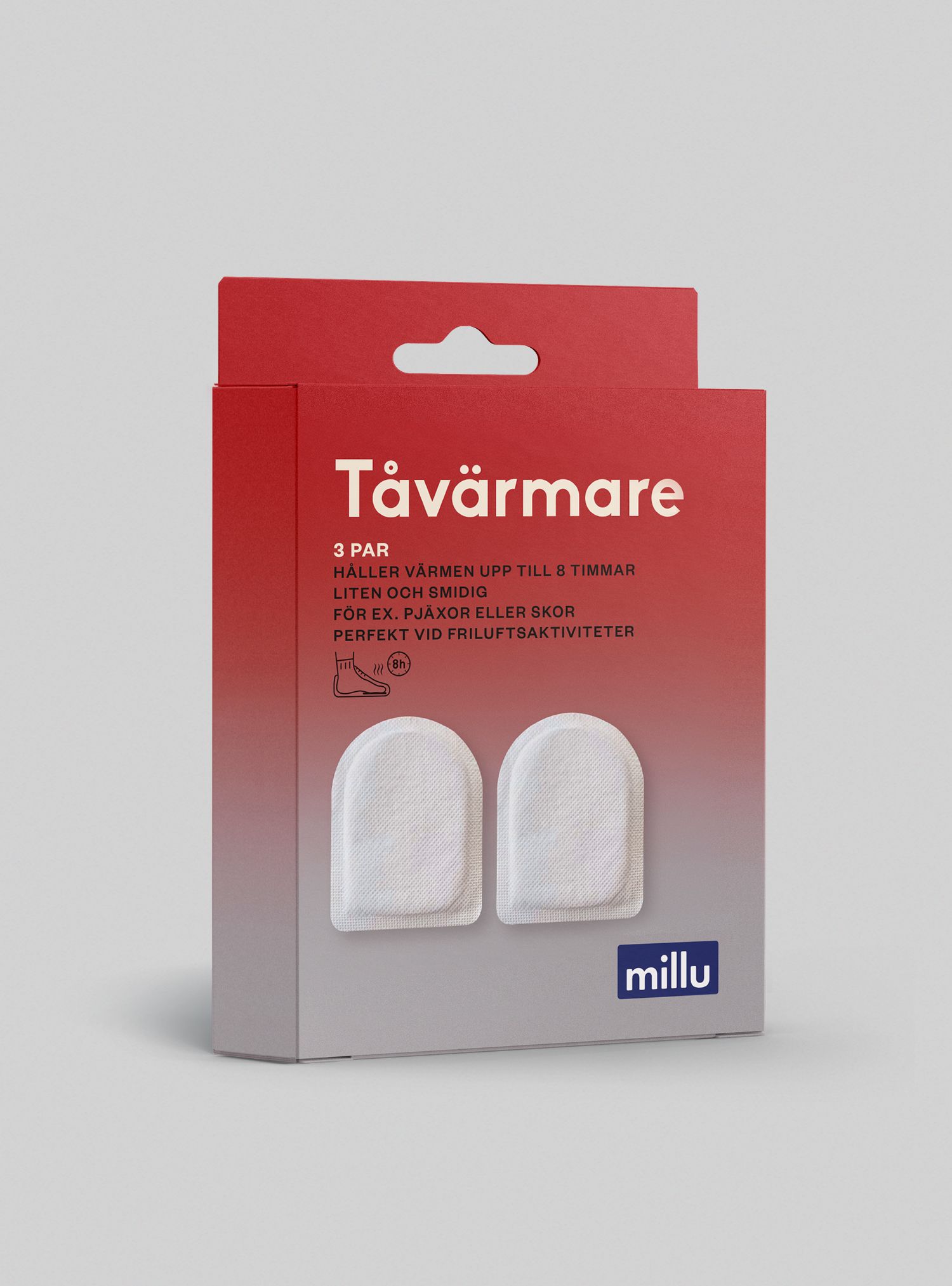
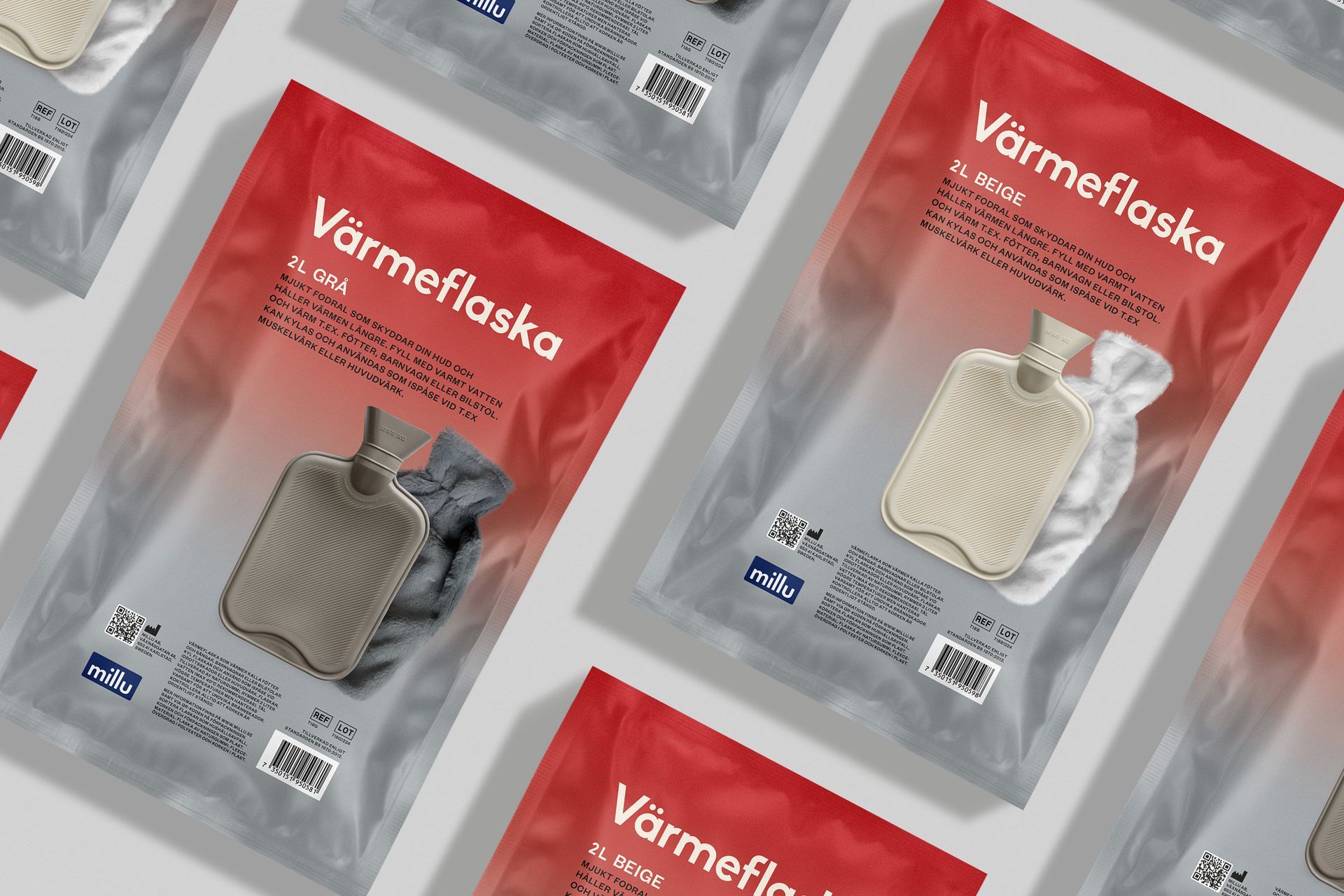
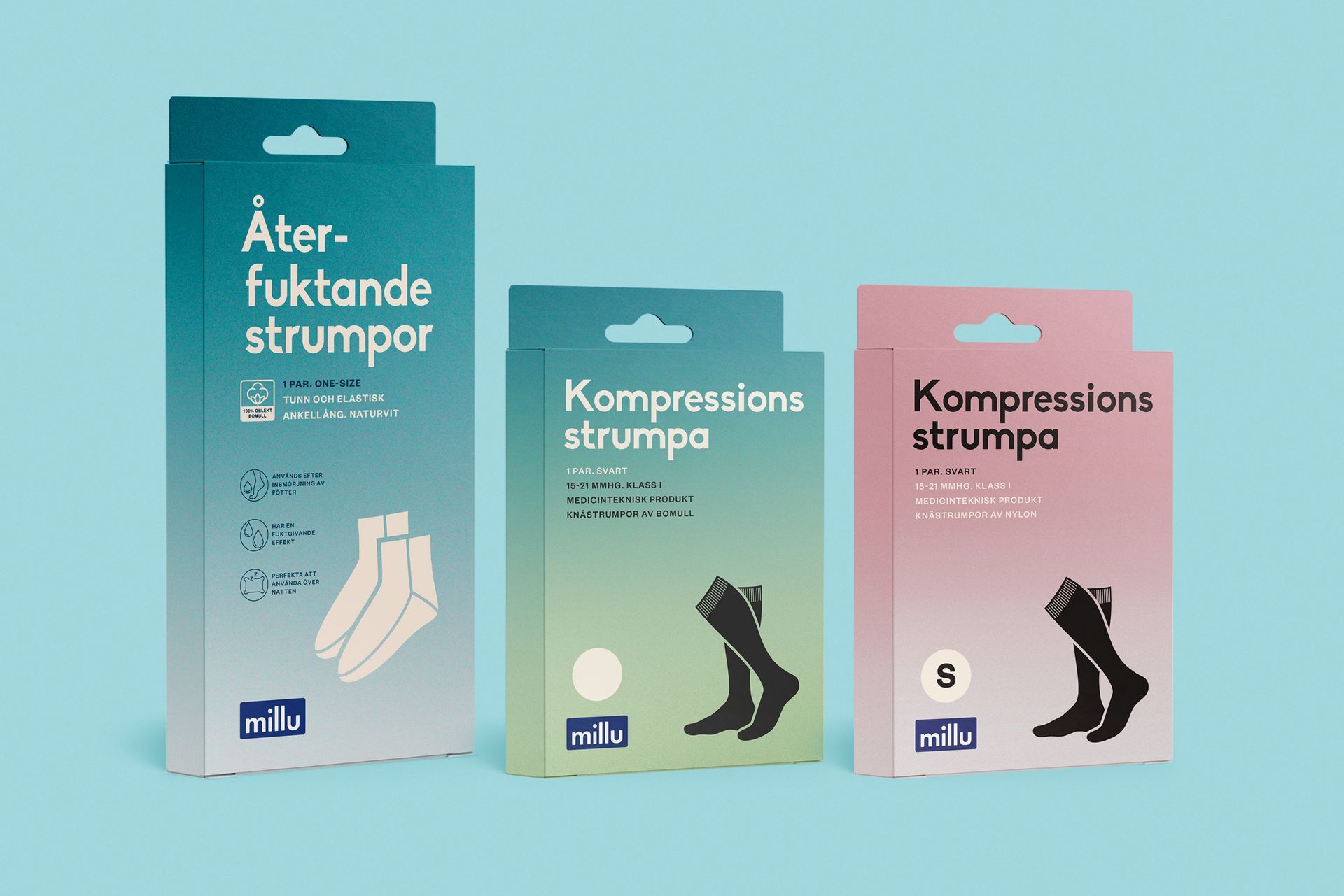
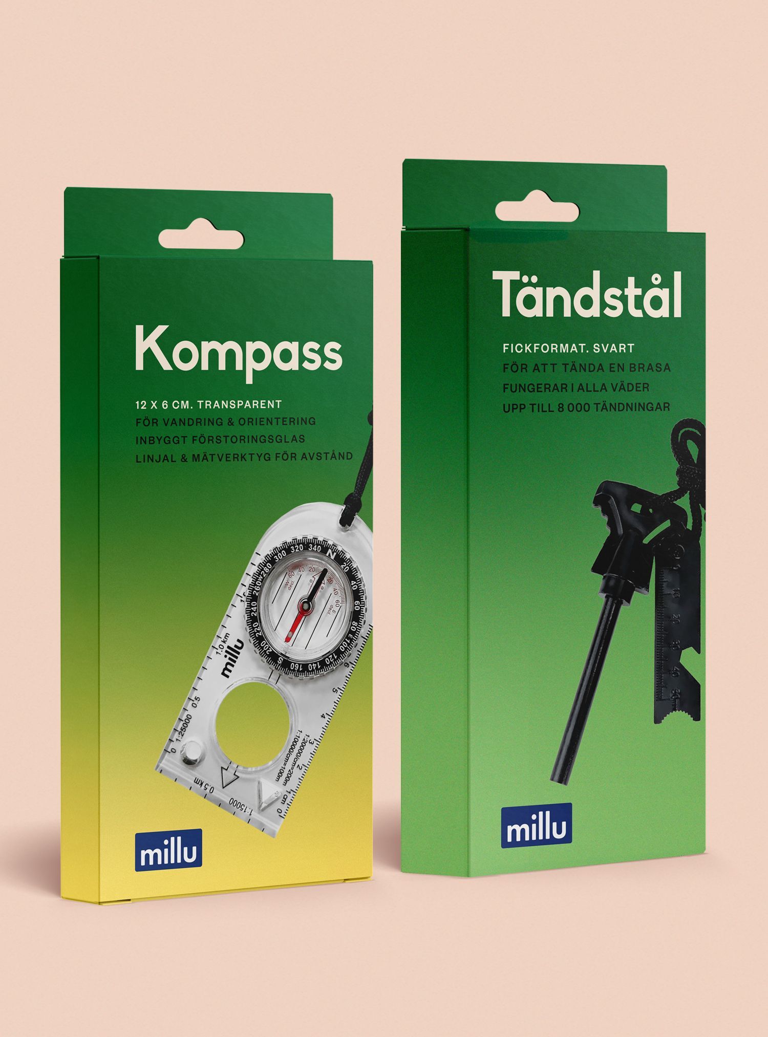
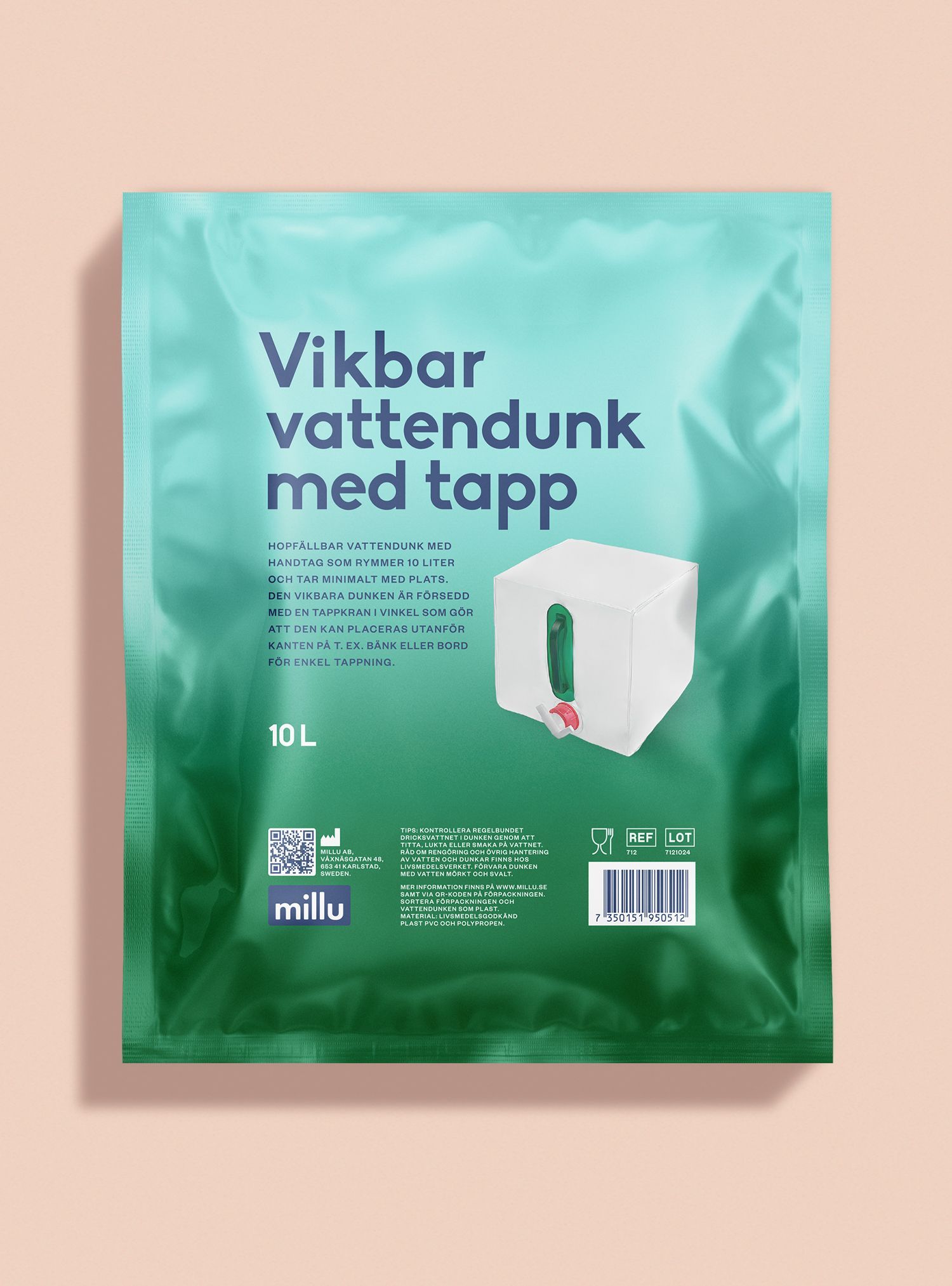
How do you make cotton gloves, emergency radios, and heated insoles feel like they come from the same brand? That was the challenge with Millu - a company with a diverse portfolio spanning sizes, formats, age groups, and categories.
At Motherland, we developed a strategic packaging design system for Millu’s pediatric line that could adapt across product types without losing brand cohesion. It wasn’t about decoration. It was about creating a scalable visual identity system that worked under pressure - on small sachets, bulky boxes, and everything in between.
The result? Shoppers found the right product in under two seconds. Every SKU spoke the same brand language - just in different dialects. Clean. Fast. Consistent.
Because in today’s market, design isn’t just how you look. It’s how you’re found.
Things we’ve done:
Millu - Medical beauty
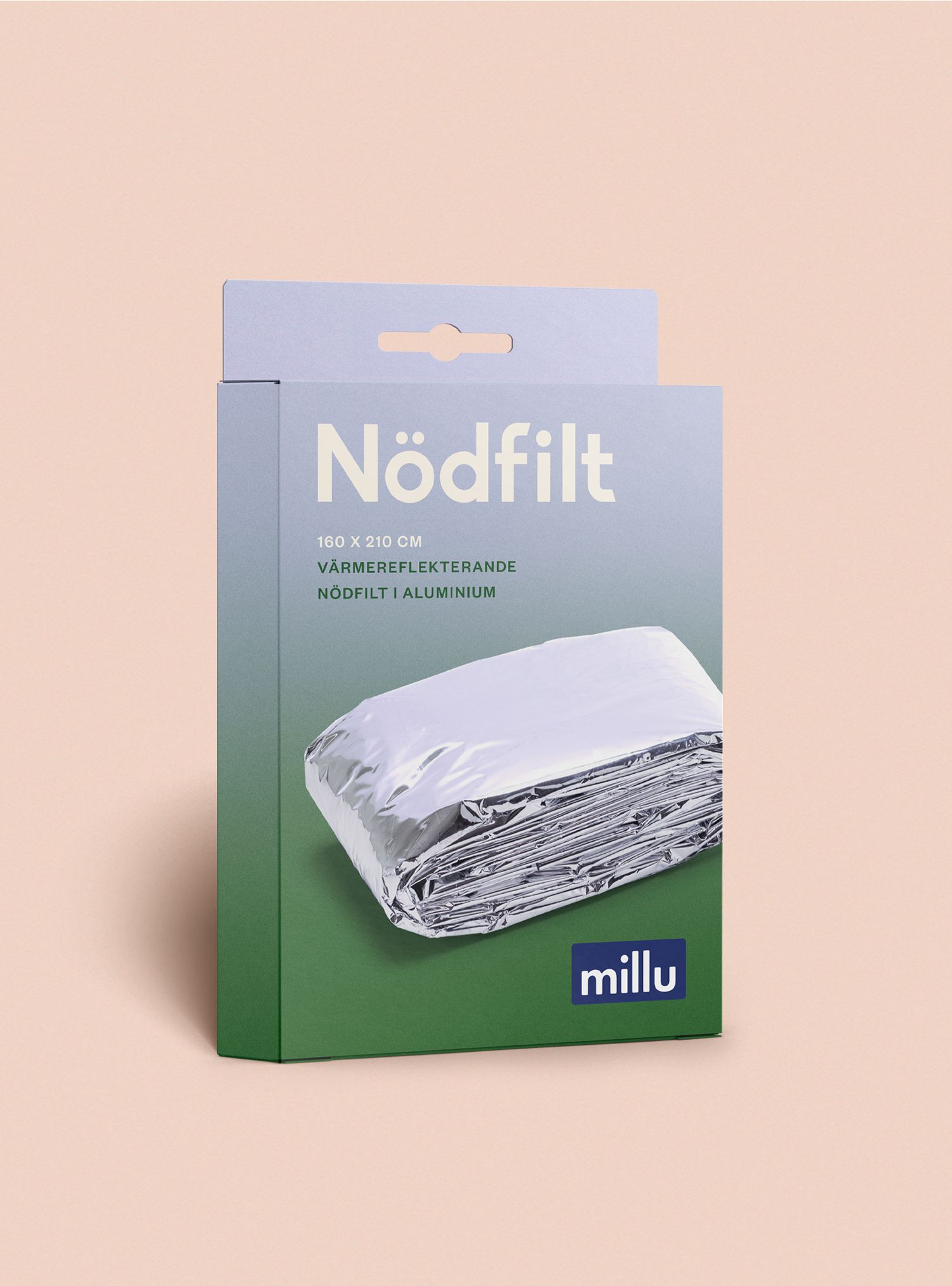
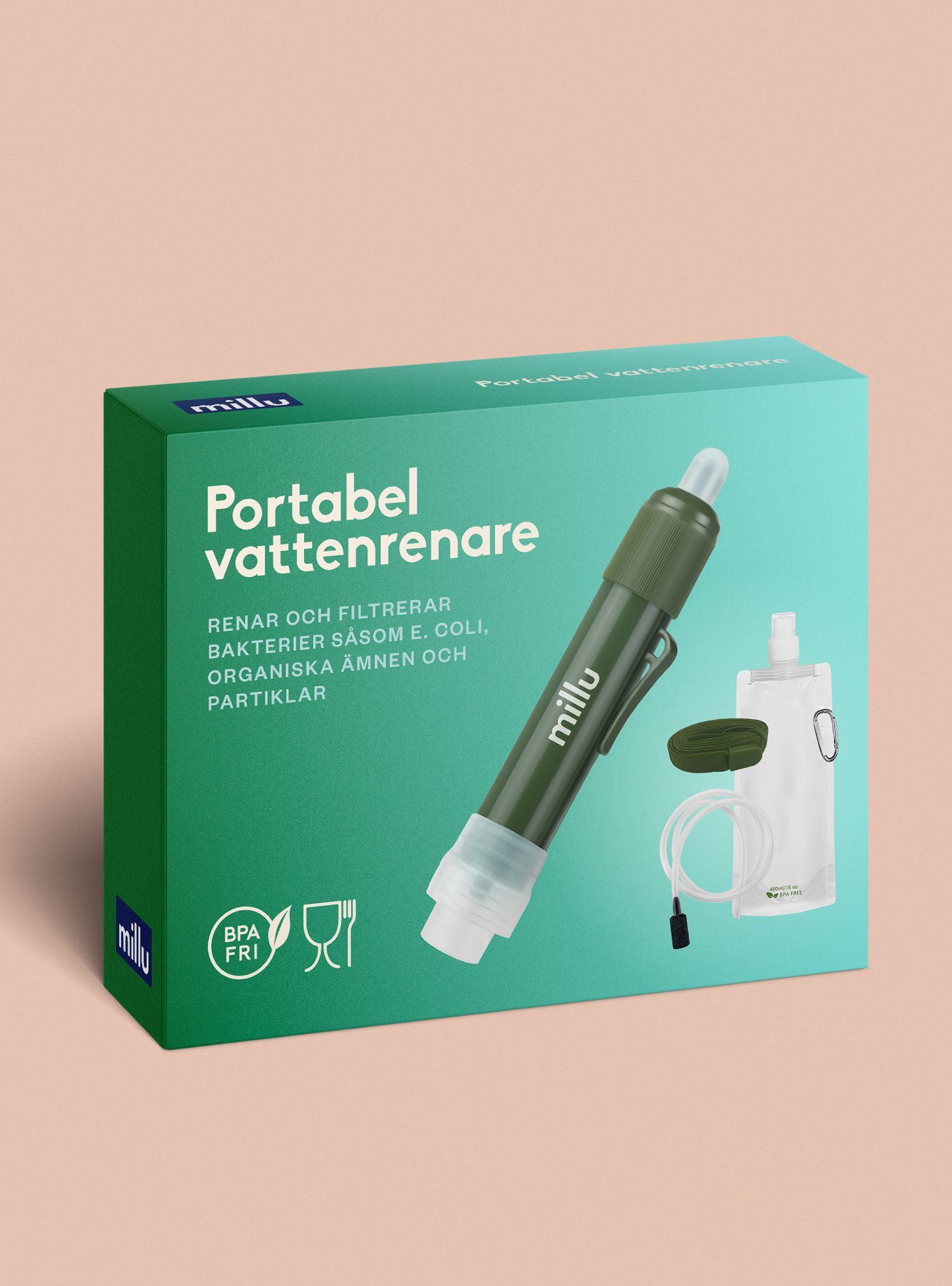
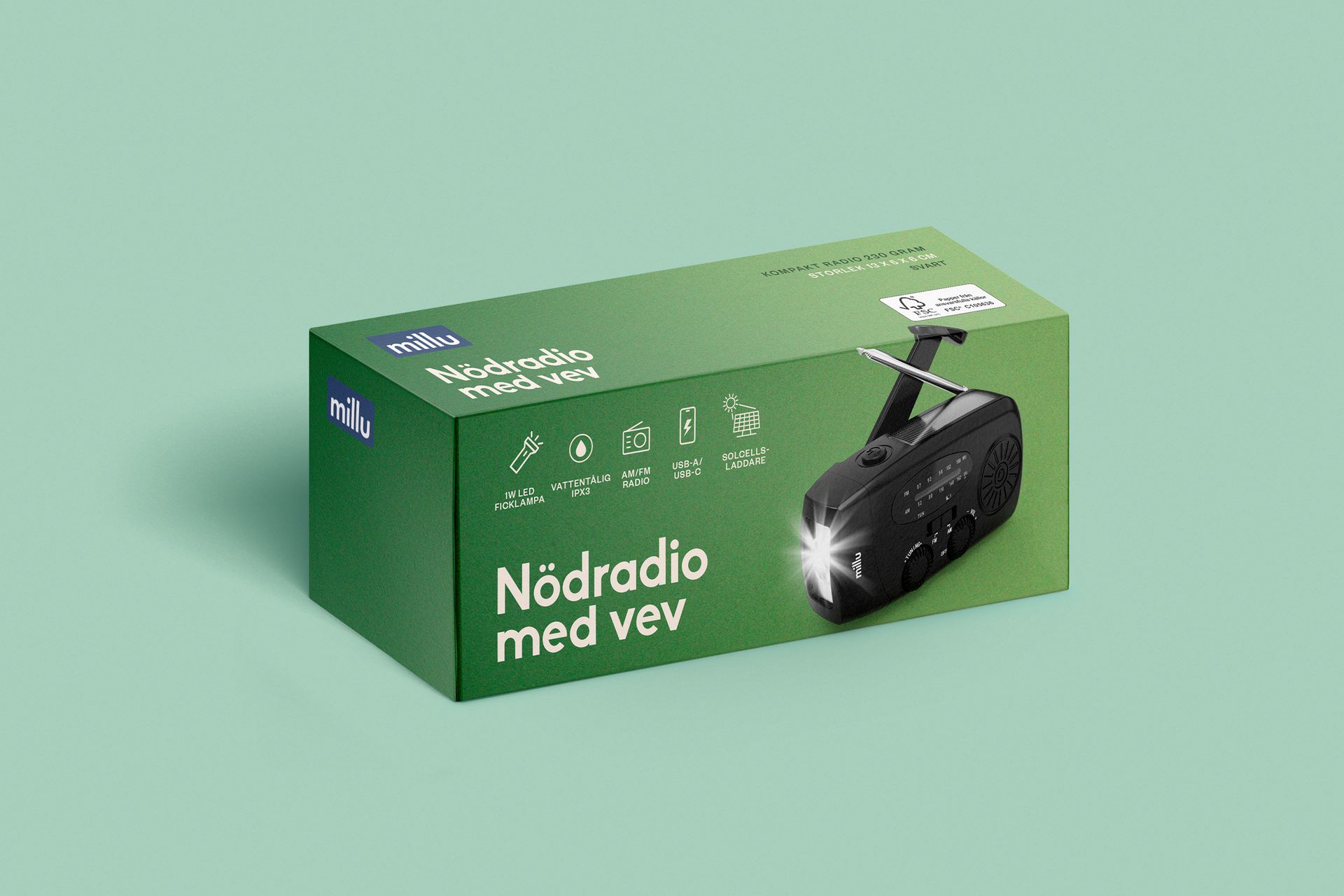
Millu - Prepping
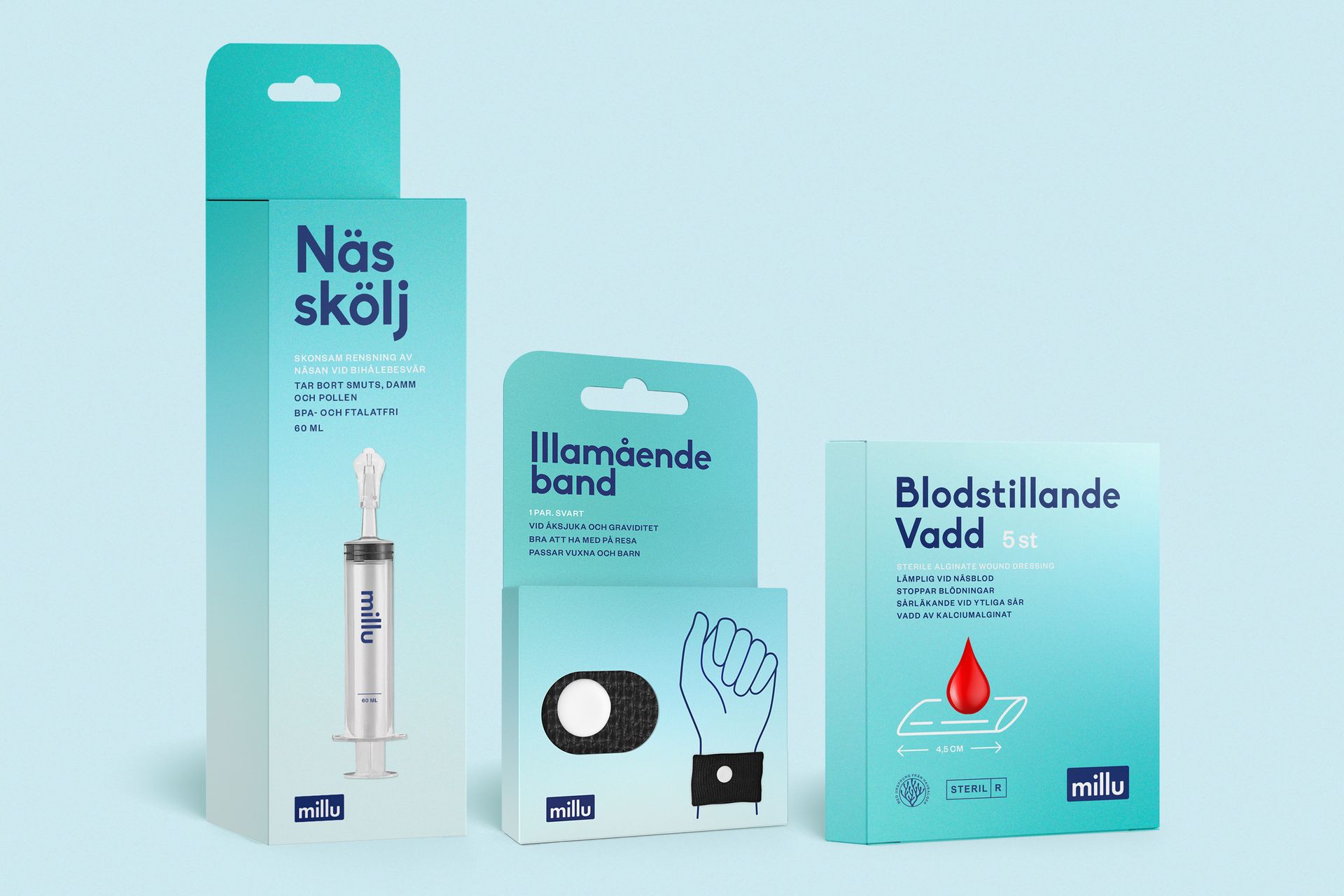
Millu - Medical
Millu - Medical protection