Atlantimor
Brand identity and packaging
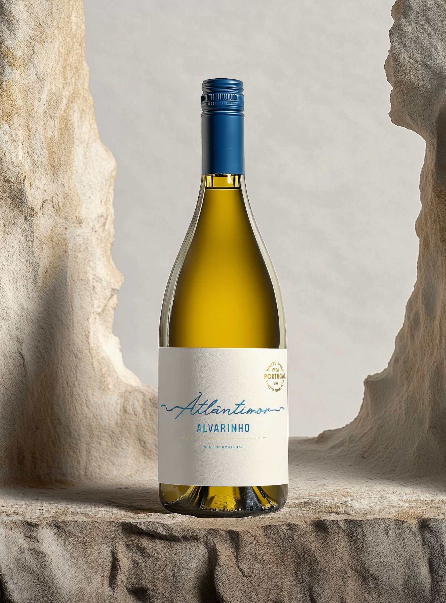
Atlântimor Alvarinho is a brand new identity built from strategy to shelf. The look is bright and modern, bright white label, Atlantic-blue script and a subtle touch of gold, mirroring the wine itself: crisp Portuguese coastal zing with mineral snap, citrus and stone fruit.
We began with competitive analysis, audience insights and business modeling to lock the positioning, then shaped a cohesive identity system, logo, typography, color palette and messaging, designed to scale across markets and channels. When sustainability is a priority, we evaluate recyclability, weight and carbon footprint to balance eco goals with durability and haptic quality.
The result is a minimal yet assured expression that lifts recognition, clarifies positioning and creates real differentiation in a tough category - ready to travel from launch to long-term growth.
Things we’ve done: